


I was messing around with stuff to try to get a cinematic darker look or gritty.
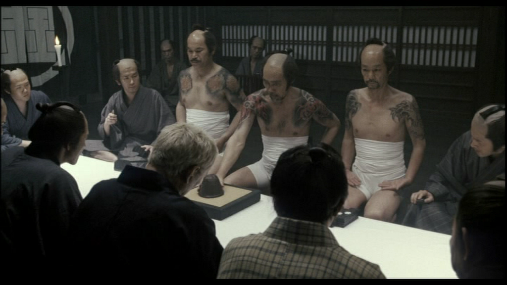
This is a nighttime scene so I'm using some blue filters. I want to get that 60s chanbara look which is overall more desaturated because the cameras were crappier then. The below is a screenshot from the 2003 Zatoichi movie which was the inspiration for this and even though it was made in 03, it still has that 60s samurai action look.
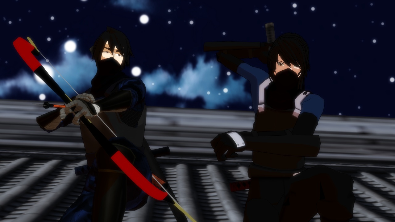
Original
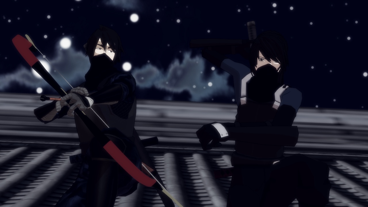
Filter A
Filter B
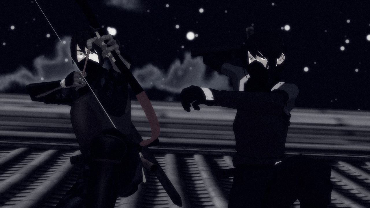
Personally I like B more but the thing is when the chars are against the sky they're hard to see- which does make sense since they're frickin ninjas but it may be too hard.
Filter A is more like a sin-city I think. B looks closer to the original color scheme of the first shinobi noir. The tough part is, I was in a pretty depressed mood when I made the original, and I'm not now so it's tough to make it that dark now.
VicariousE
I never thought you'd be using photographic terms, just shows how fucking tenacious you are :) I like B as well, and agree with your other assertions too... maybe if the clouds showed a bit of transparency when they're in front of the moon(s) and stars. Dim pics are okay, so long as finer details can be seen in the edges and BG... or is this an evening shoot, but with a couple polarizing filters over the lens (old trick to simulate night, but have even lighting)?